Tobias Niemann
Logo Design
Client: Tobias Niemann
Services: Logo Design
Client was a physiotherapist who asked for a unique logo. He wanted to distance himself clearly from the typical logos you see when you google for physiotherapy. He additionally mentioned on several occasions his logo should be his trademark, but wasn't intended for bringing in new patients.
He also did not want to focus on typical words associated with physiotherapy such as wellness, feelgood, he wanted to completely ditch the esoteric feel about it. People often mix up physiotherapy with wellness massage and he wanted to focus on the three terms which also are his motto: function, mechanics and structure.
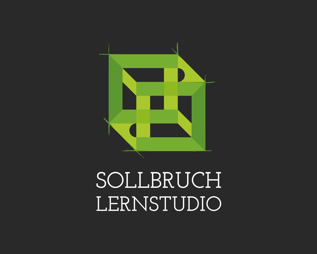
Now, you very often see spines, caring hands and hand/body combinations or just a stylized person when it comes to physiotherapy logos. Of course, in my first round of sketches I used these, too - you use every single thought that comes to mind in order to later in the process come up with not so typical concepts.
I only incorporated a spine in one of the three concepts I presented him with and it wasn't even showing the spine but implying it via the form of a muscle. Another thing that was important to him was incorporating the Vitruvian Man. Now, the Vitruvian man also often serves as a logo, most of the time he's used on it's own and only stylized or colored differently. Also, he asked to ditch typical feelgood colors like apricot, pink and yellow and try something fresh. He was going for green.
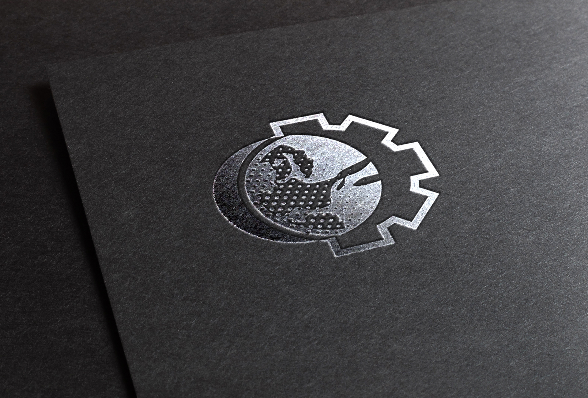
Mockup Silver print on black paper
So I needed to find a way to create something that should say function, mechanics (both presented by cogwheel) and structure (presented by the dot pattern) and incorporate the Vitruvian Man somehow without making him the main motive, plus use green color(s).

What's in the beginning? A load of brainstorming, then mindless sketching, scribbling and doodling for the first round of finding ideas. This, of course, is a mockup, but the sketches and ideas were taken from my sketchbook, Adobe Ideas and some random paper I drew sketches on.
It really isn't what you think of when thinking about Physiotherapy. It's not the orange/peach feelgood image that says „You'll feel so great after our massage“ but it is as technical and functional as the client asked it to be.
There are several versions for different usage, colorwize.

Various versions for different printing options
He did say he wasn't planing on using it in small spaces etc., but in case this changes I have also kept a dot-free version in place for better display on very small objects.
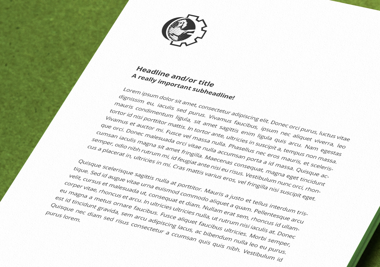
Mockup on a letter