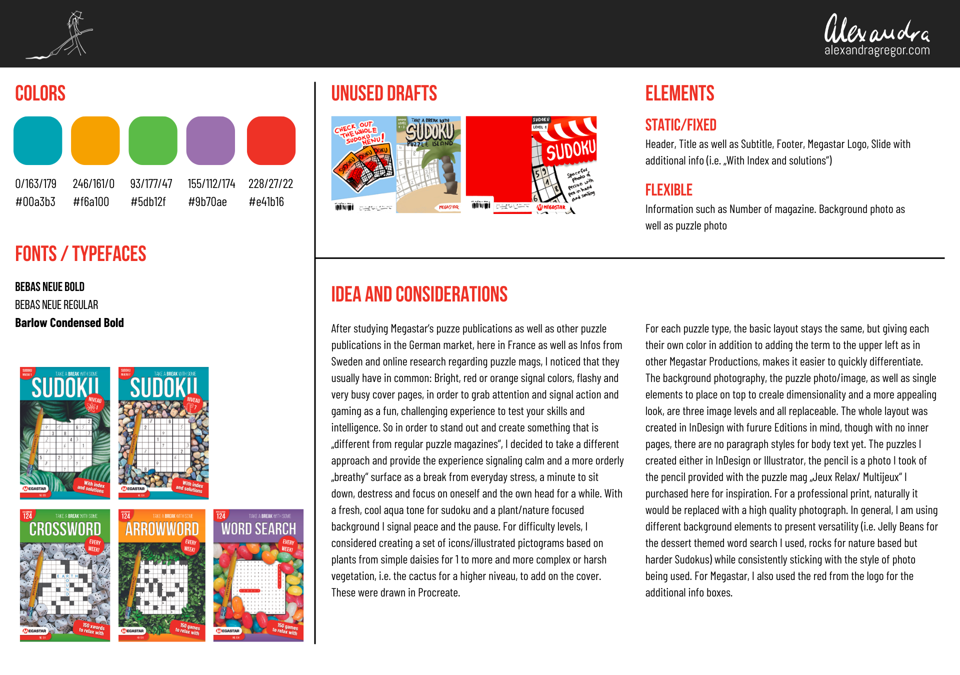

Herausforderung: Konsistenz im internationalen Verlagsdesign
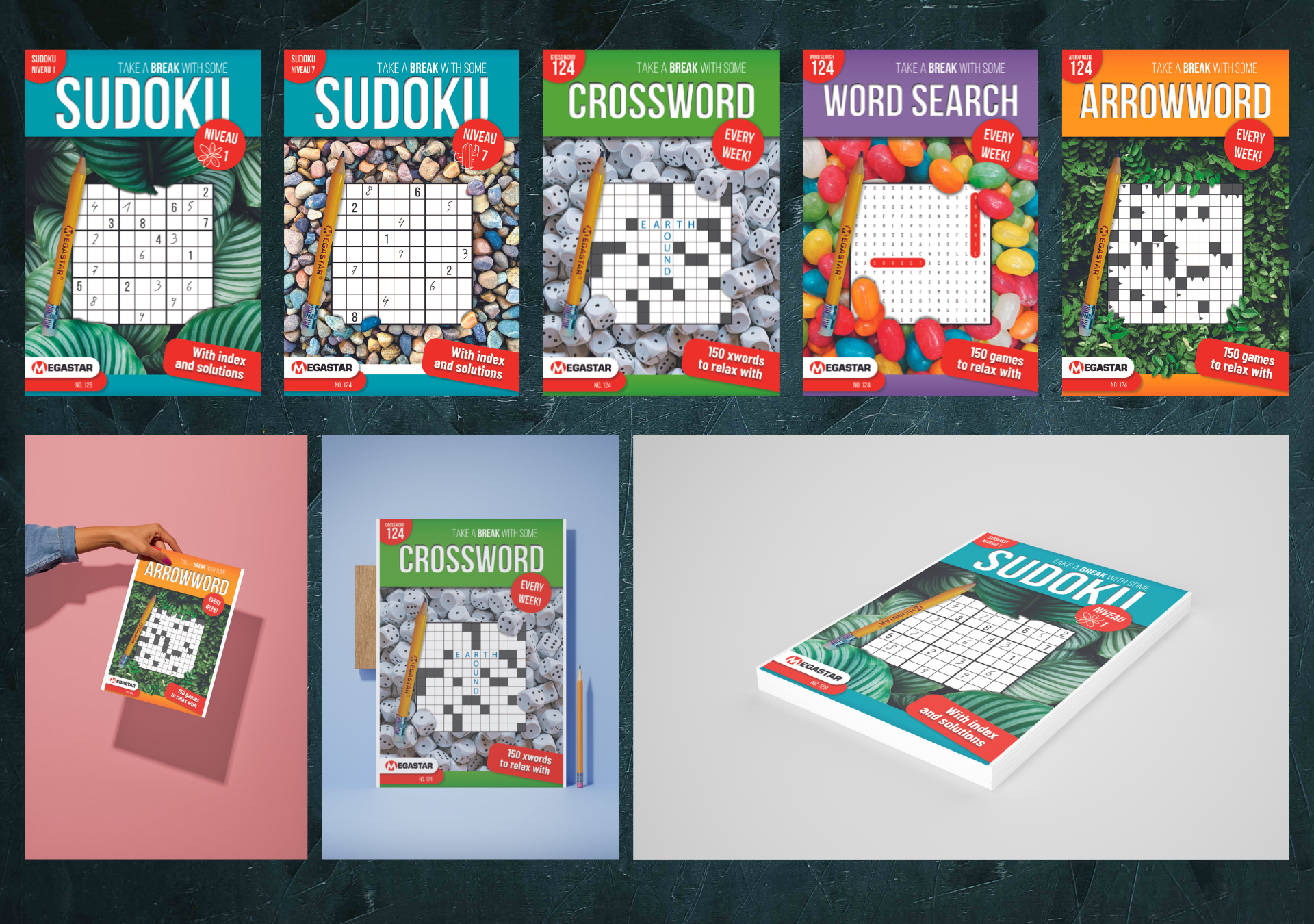
Keesing Media Group, einer der größten Puzzle- und Rätselverlage Europas, benötigte für die Megastar-Marke ein einheitliches Cover-Design für verschiedene Publikationen (Sudoku, Crossword, Word Search, Arrowword). Die Herausforderung: Jedes Magazin sollte einen individuellen Look behalten, zugleich aber Teil einer wiedererkennbaren Serie sein – eine Aufgabe zwischen Corporate Design und Editorial Branding.
Lösung: Editorial Branding & visuelle Systematik für Magazine
• Ich entwickelte ein skalierbares Designsystem, bestehend aus:
• Farbpalette für unterschiedliche Titel & Schwierigkeitsgrade
• Klare Typografie mit Fokus auf Lesbarkeit & Wiedererkennbarkeit
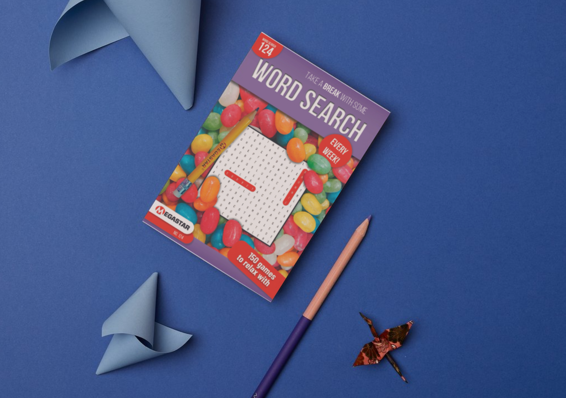
• Bildkonzept (Food-/Objektfotos, Illustrationen, Pattern-Elemente) zur Unterscheidung der Reihen
• Strukturierte Layout-Guidelines, die flexibel an internationale Märkte angepasst werden können
• Farbpalette für unterschiedliche Titel & Schwierigkeitsgrade
• Klare Typografie mit Fokus auf Lesbarkeit & Wiedererkennbarkeit
• Bildkonzept (Food-/Objektfotos, Illustrationen, Pattern-Elemente) zur Unterscheidung der Reihen
• Strukturierte Layout-Guidelines, die flexibel an internationale Märkte angepasst werden können
Das Ergebnis: ein modulares Gestaltungssystem, das sich nahtlos auf alle Titelvarianten übertragen ließ und gleichzeitig eine klare visuelle Markenidentität schuf.
Starke Markenwahrnehmung & effizientere Produktion
Die konsistente Titel-Linie sorgte für höhere Wiedererkennbarkeit am Markt, stärkte das Employer Branding von Keesing als internationalem Verlag und vereinfachte den Produktionsprozess für künftige Magazine. So konnte Megastar seine Marktposition im Bereich Rätselpublikationen festigen.
Challenge: Consistency Across International Publication Design
Keesing Media Group, one of Europe's largest puzzle and activity magazine publishers, needed a unified cover design system for their Megastar brand across multiple titles — Sudoku, Crossword, Word Search, and Arrowword. The challenge: each magazine needed its own distinct look while remaining instantly recognizable as part of a cohesive series. A balancing act between corporate design consistency and editorial branding flexibility.
Solution: Editorial Branding & Visual Design System for Magazine Series
I developed a scalable design system built around:
• A color palette differentiating individual titles and difficulty levels
• Clean typography prioritizing readability and brand recognition
• An image concept — food and object photography, illustration, and pattern elements — to visually distinguish each series
• Structured layout guidelines adaptable to international markets
The result: a modular design system that transfers seamlessly across all title variations while establishing a clear, ownable visual brand identity.
Stronger Brand Recognition & Streamlined Production
The consistent cover lineup increased market visibility, reinforced Keesing's positioning as a serious international publisher, and simplified the production workflow for future titles — helping Megastar strengthen its foothold in the activity publishing category.