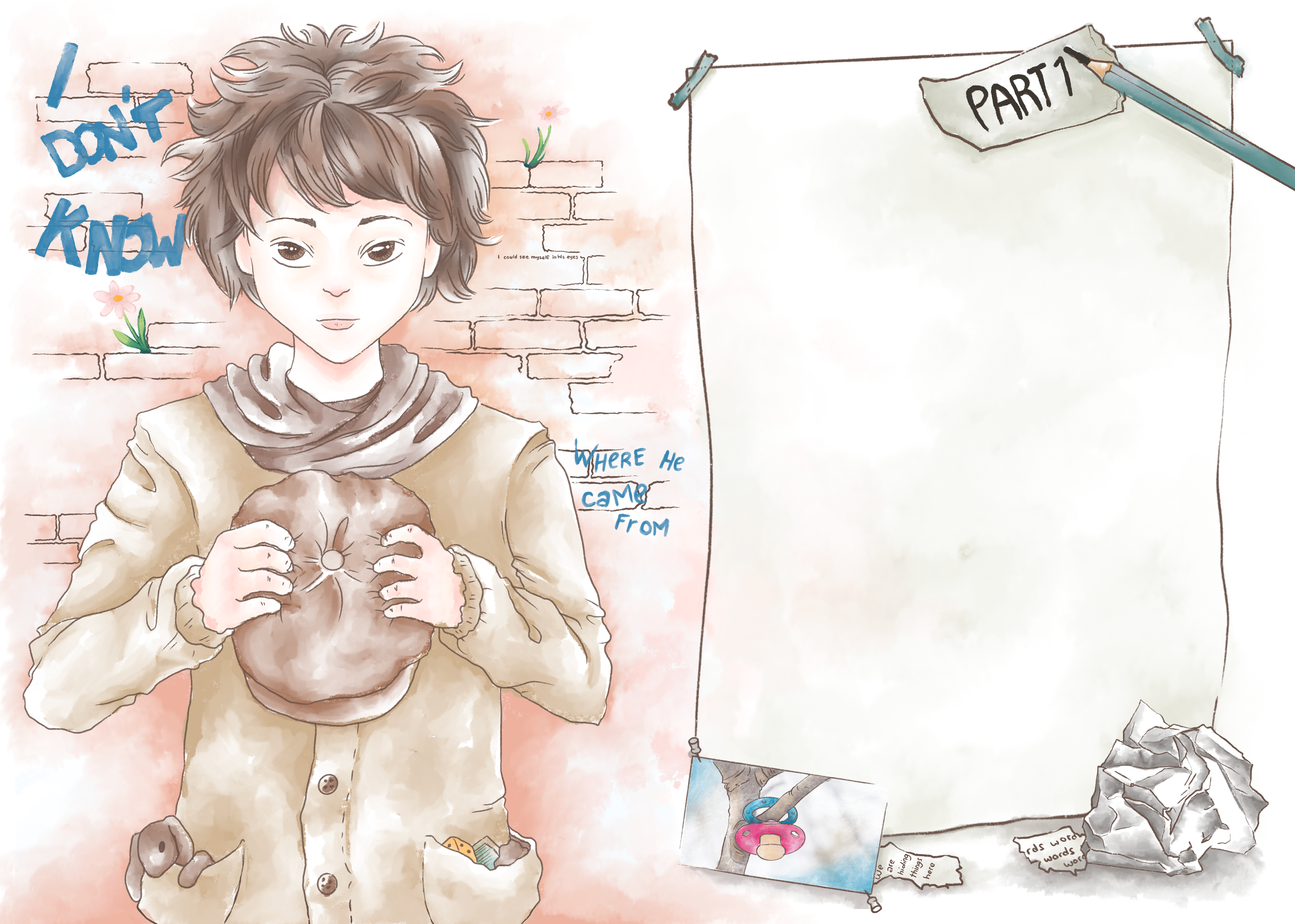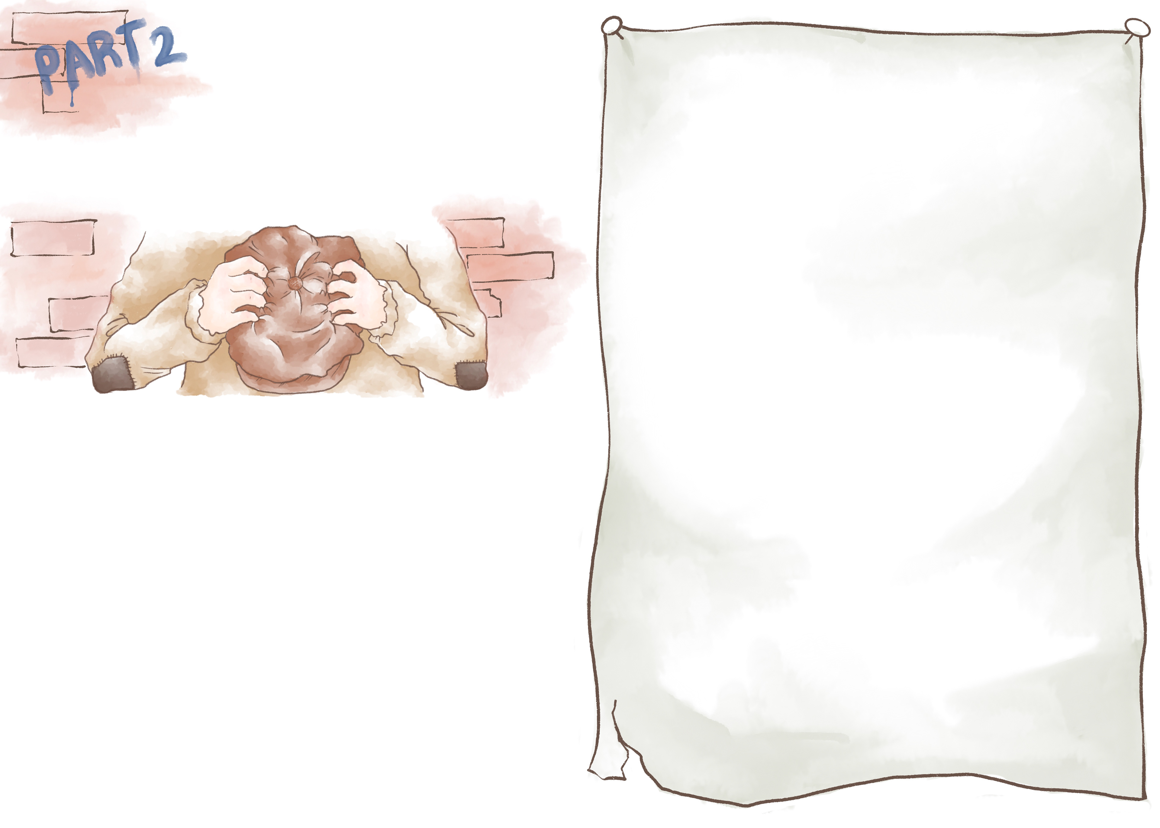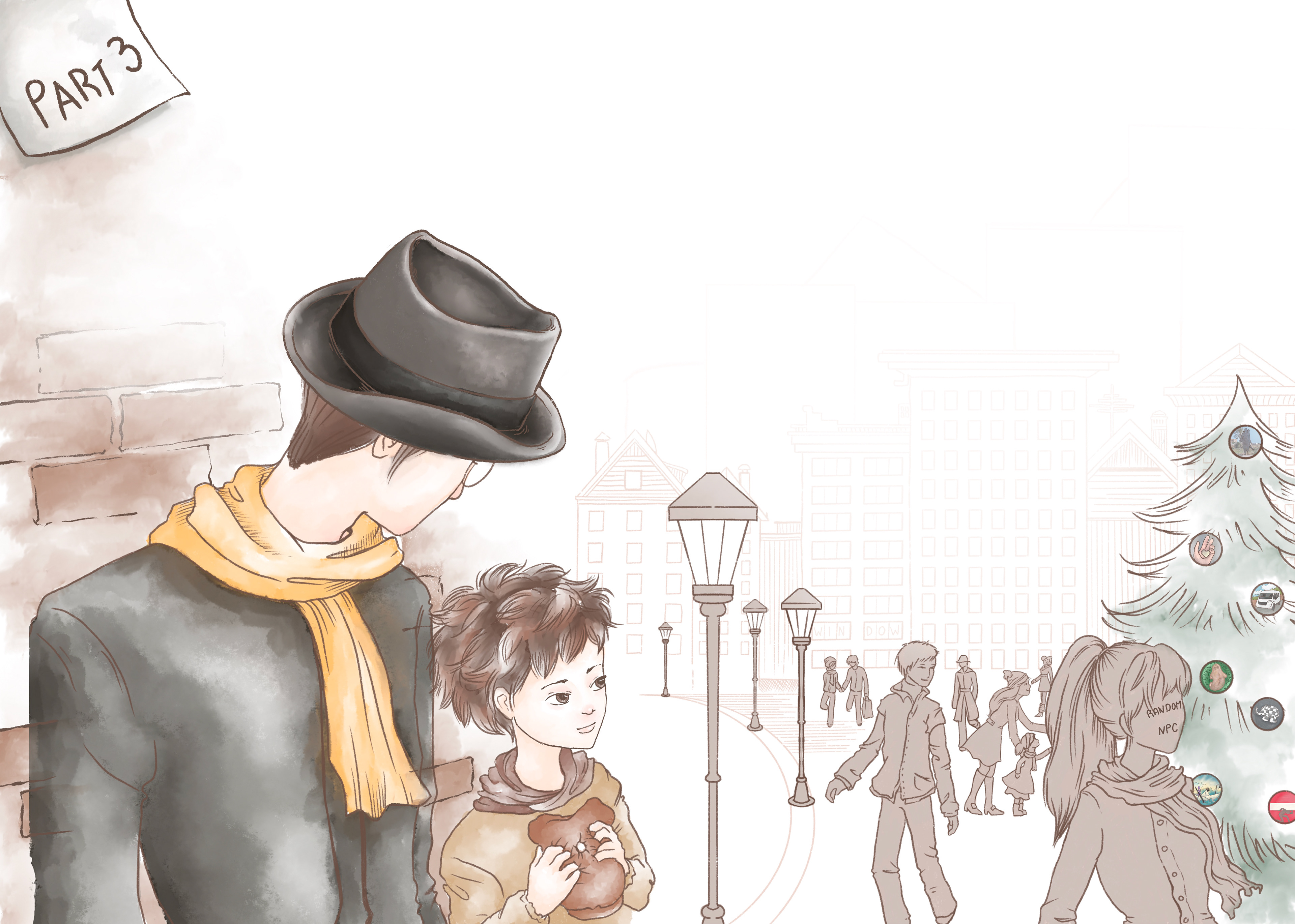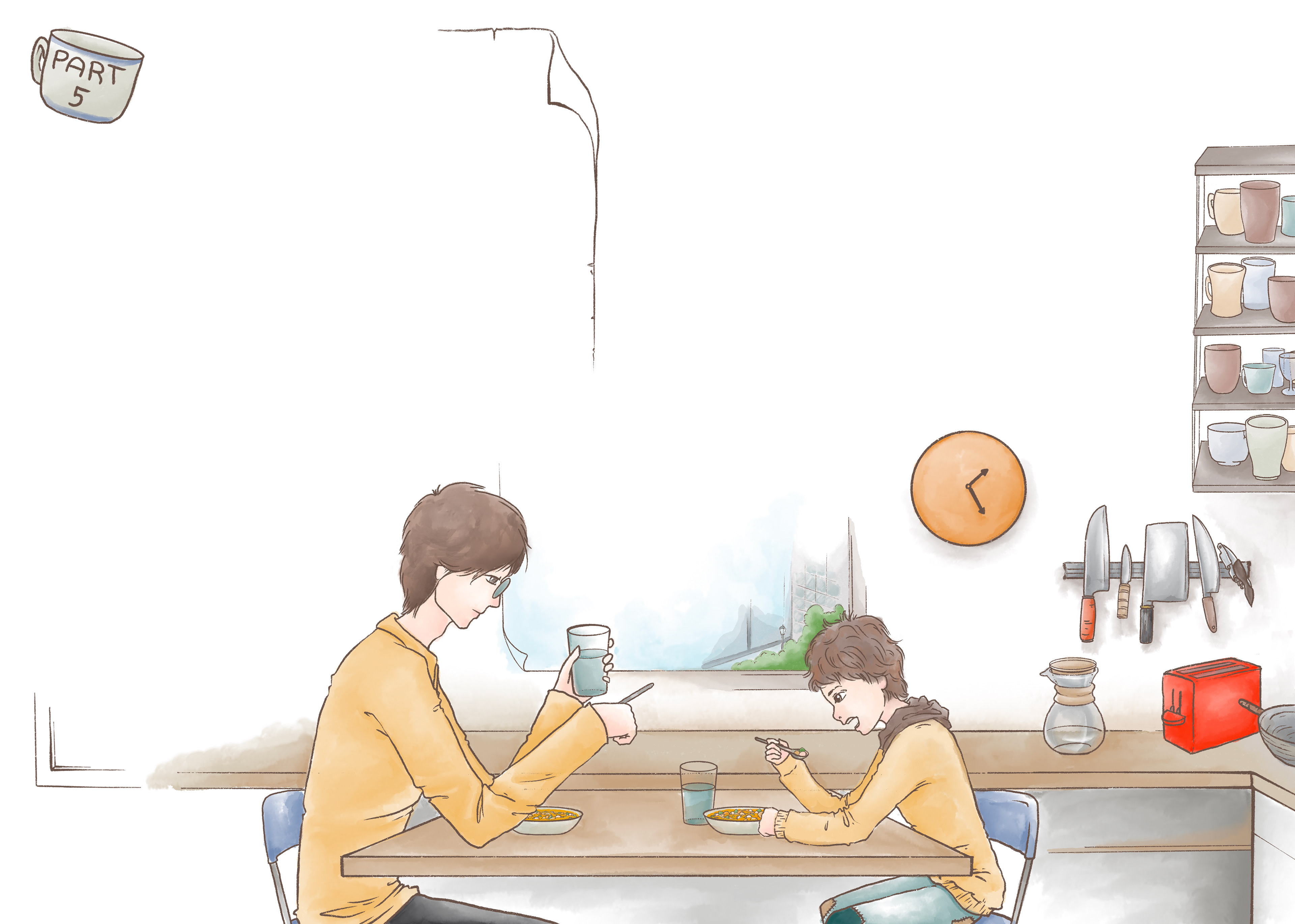

The Book and its "metaism"
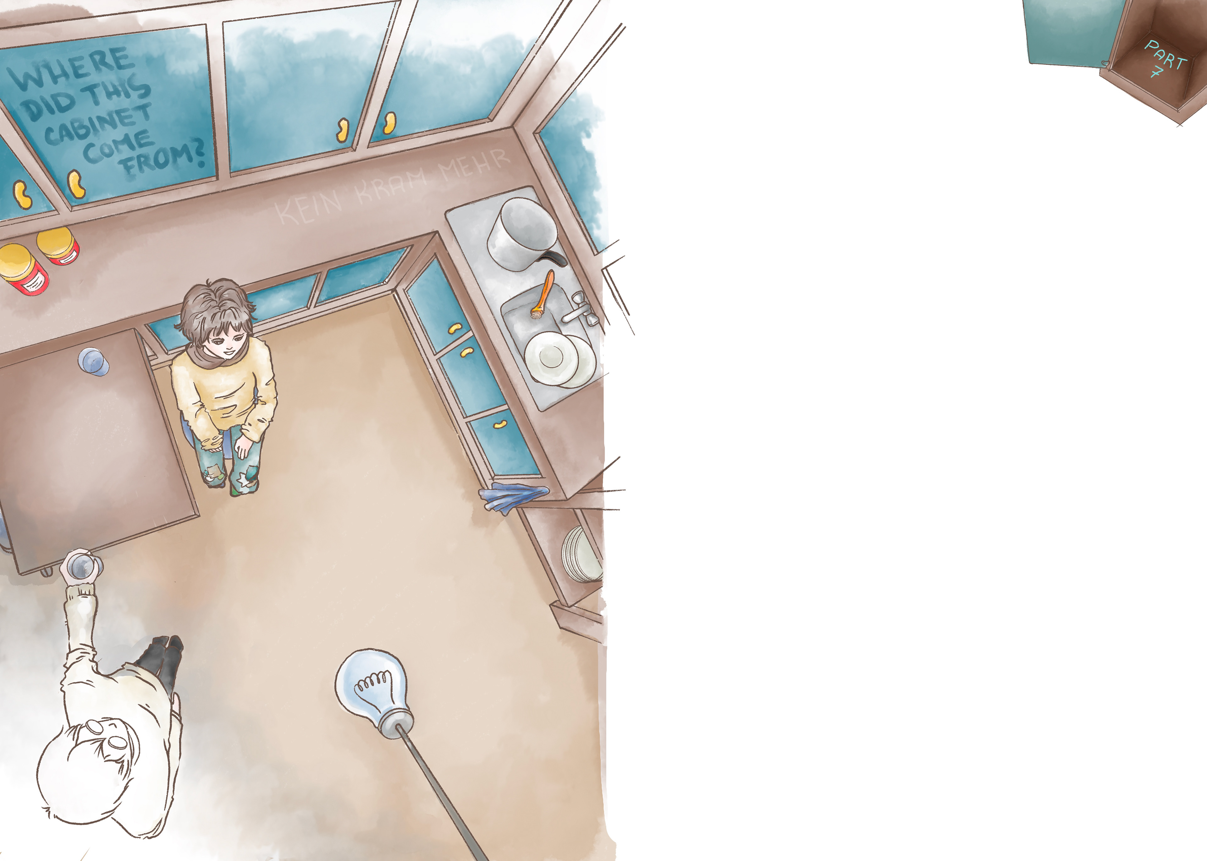
The novel "A Christmas Carol of Some Sort" by Tobias Rohde has sweet, innocent, melancholic, searching and a lot of meta elements, which the author and I both collaborate on via the text and a very image heavy integration of the text in form of the writer's handwriting into the image. At the same time we integrate meta commentary referencing images, text, plot holes or apparent mistakes with the imagery according to the story, as little side notes between editors who are supposedly sending the drafts back and forth, discussing content and acknowledging or even pointing to details or meanings. Who the commenters are doesn't really matter as the commentary and what it references are meant to just be pointers or little thought provokers.
Target Audience and Illustration decisions
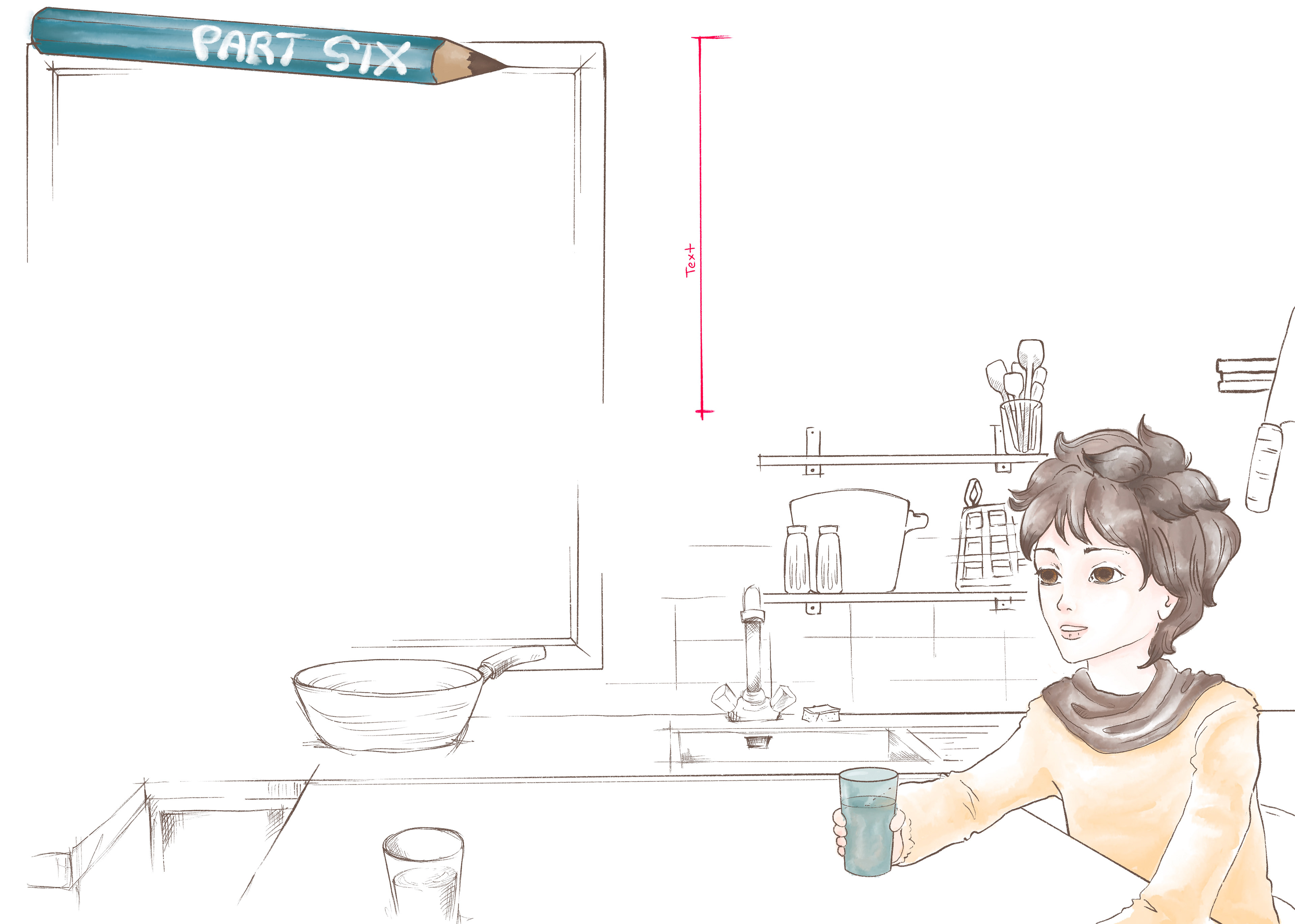
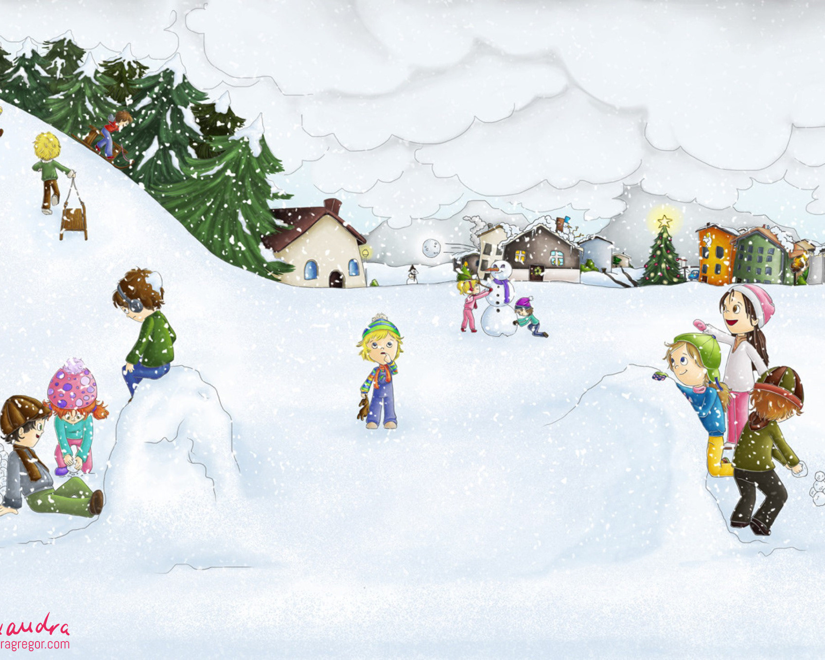
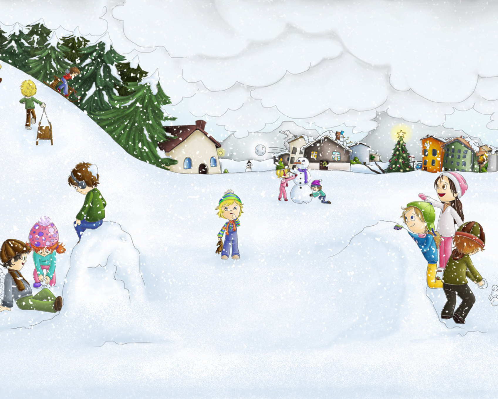
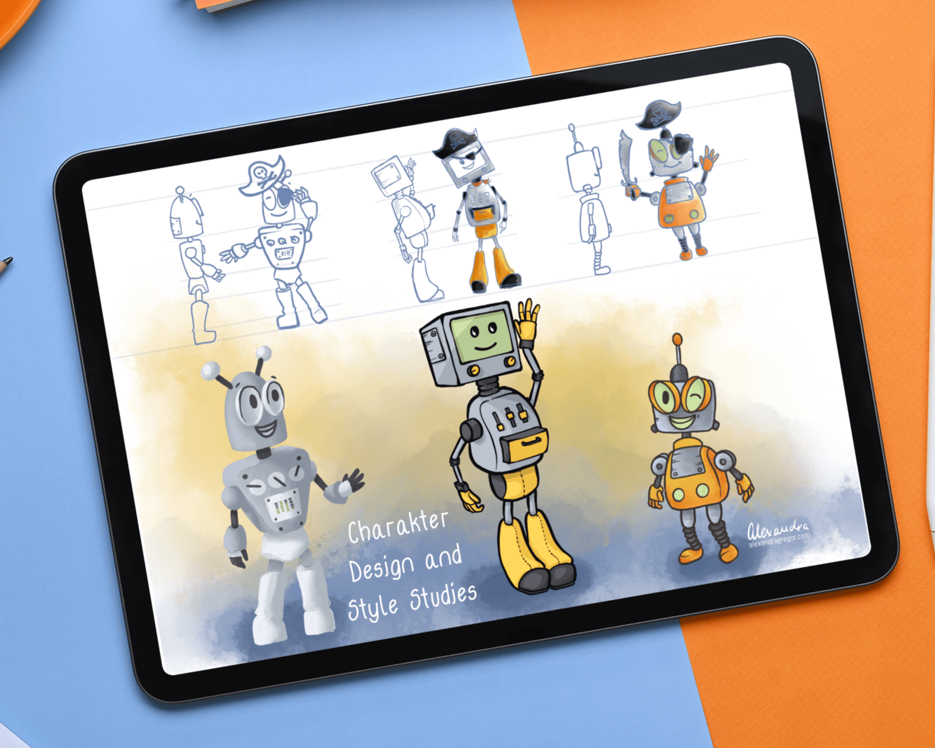
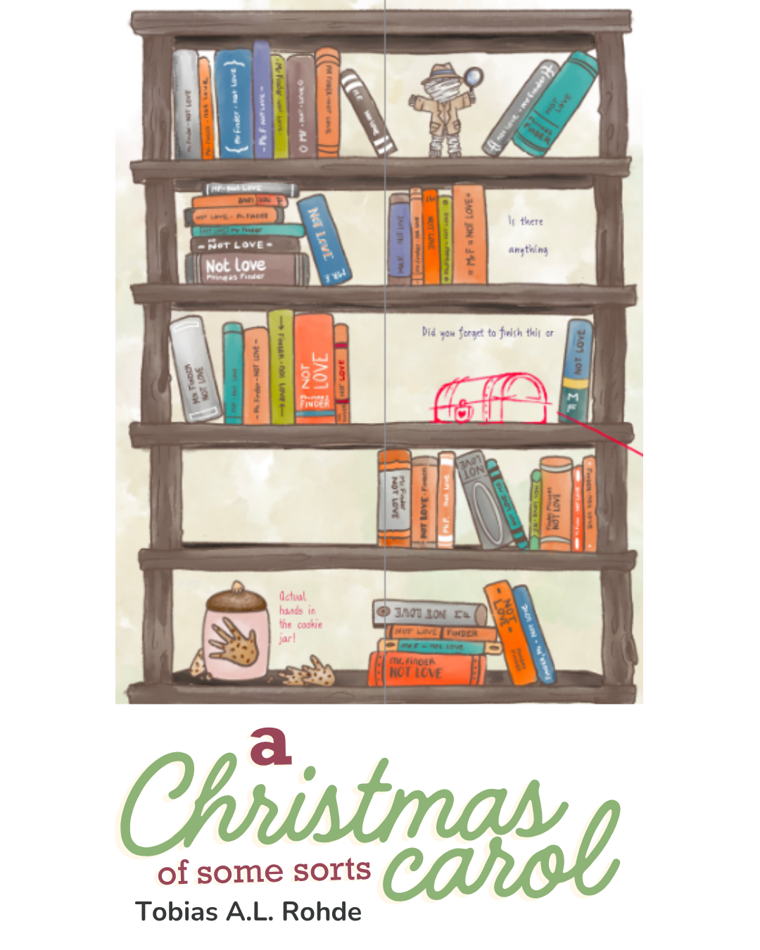
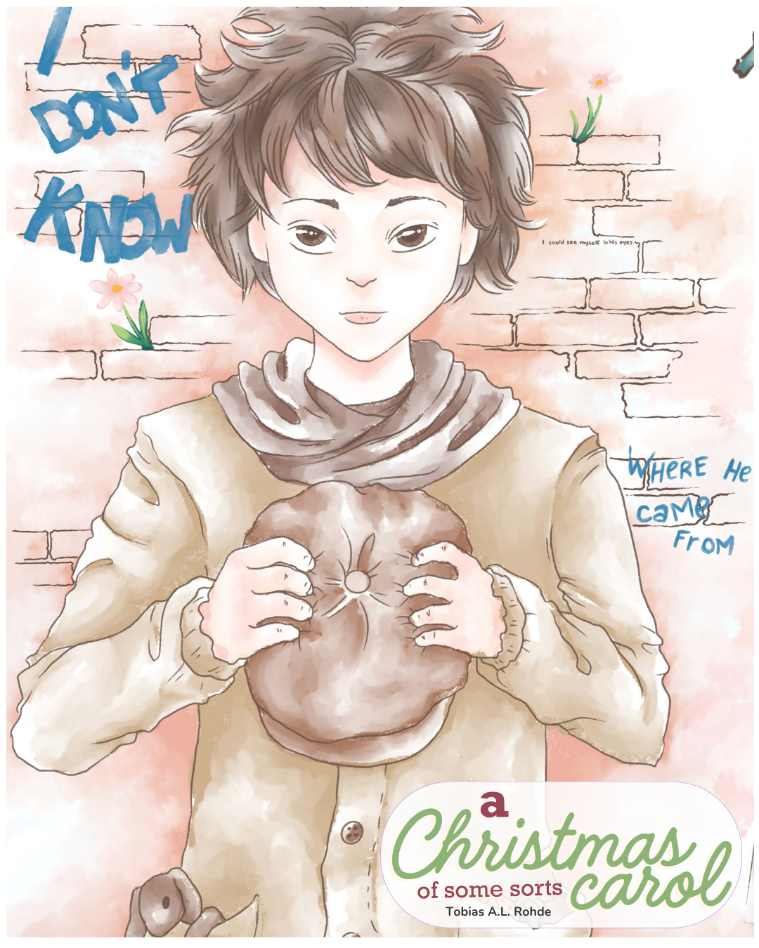
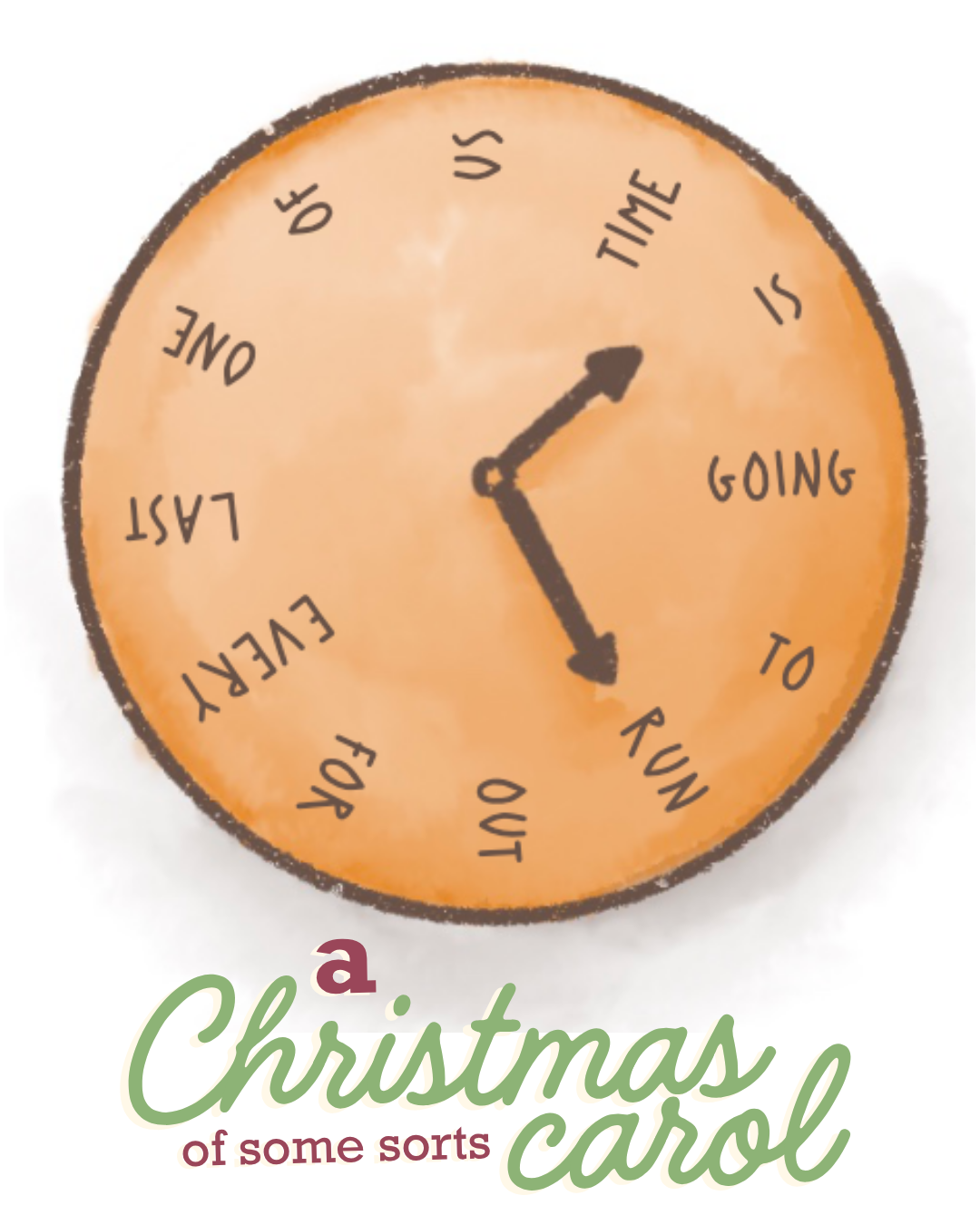
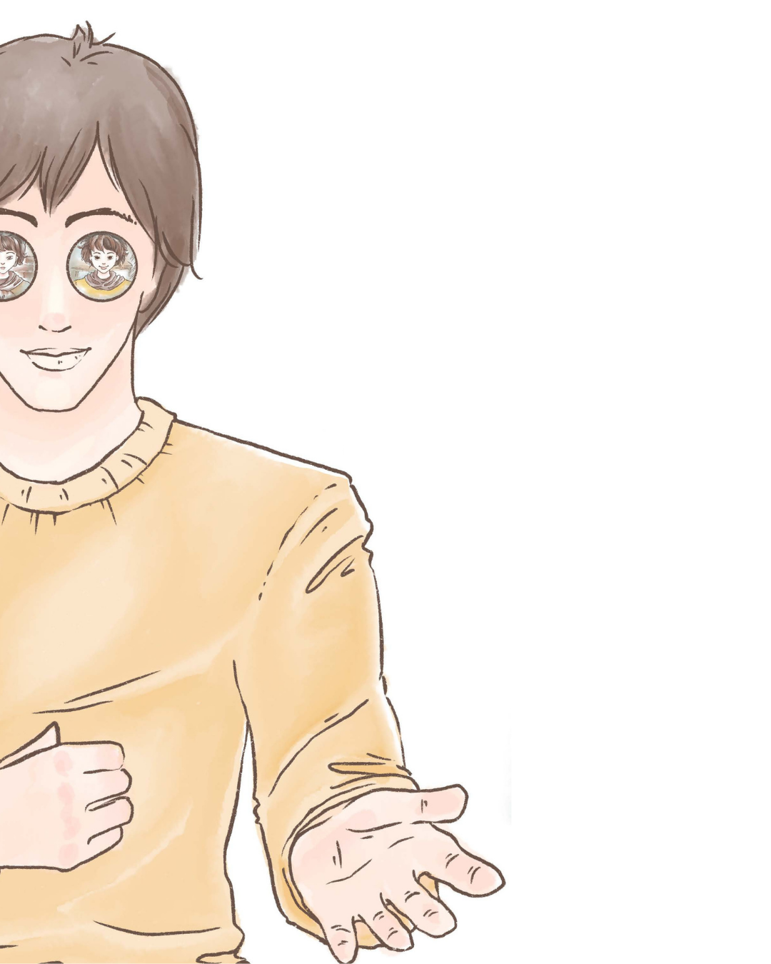
This book is meant to be read by an adult or adolescent audience with a child's eye and sense of wonder, curiosity, and heart to explore. This posed as challenging since the audience is not really children, but the illustrations were meant to be drawn as though it was. I chose a digital watercolorish Brush combined with a small selection of other brushes and a color palette in mostly earthy tones reflecting the nostalgic tone of the narration and the way the boy is repeatedly referenced as looking like a vintage painting.
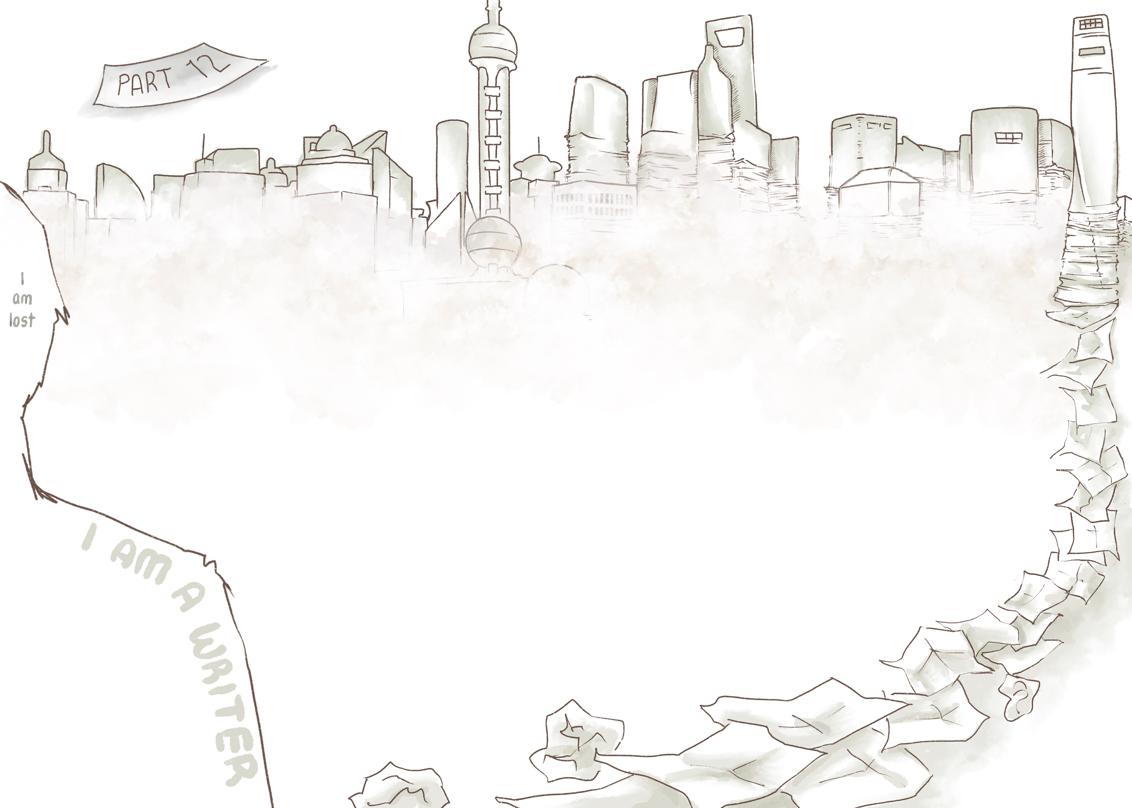
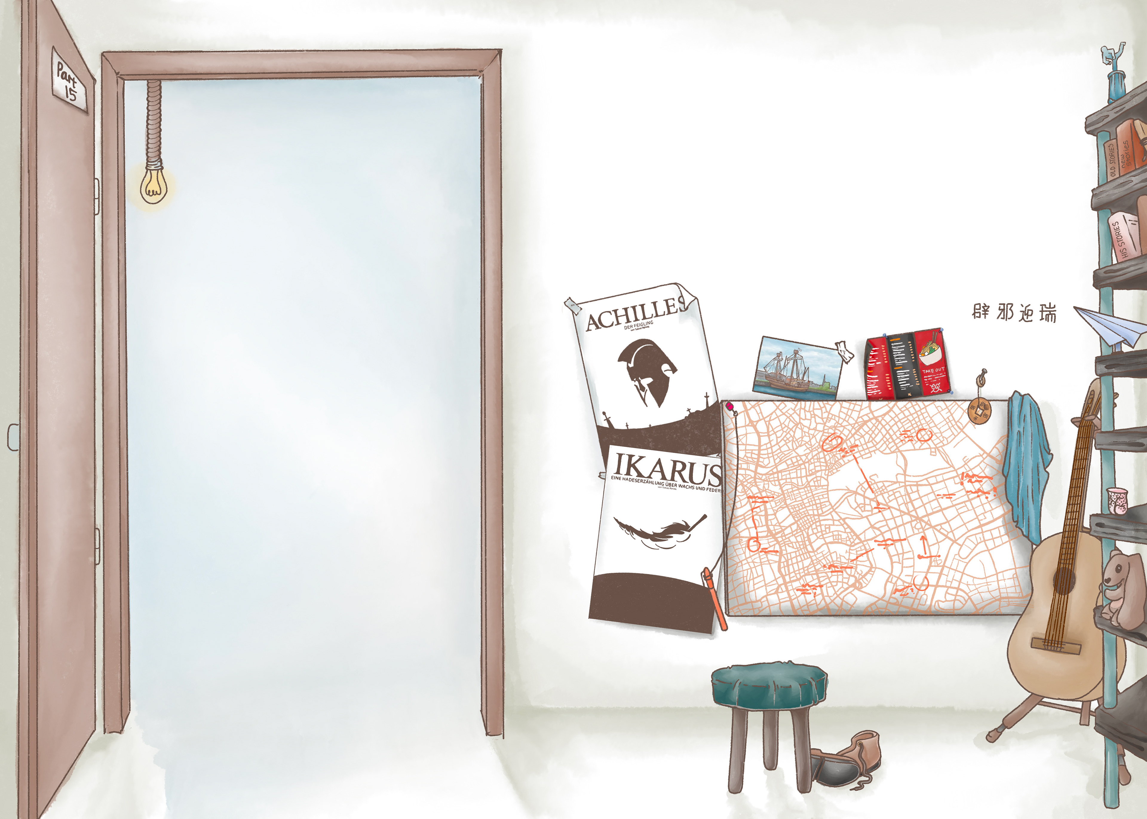
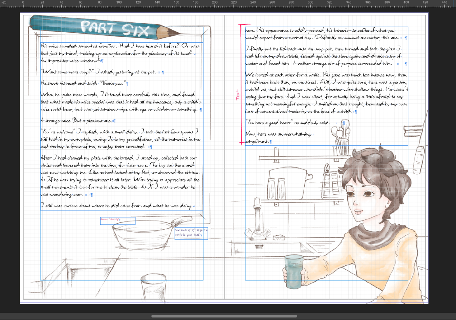
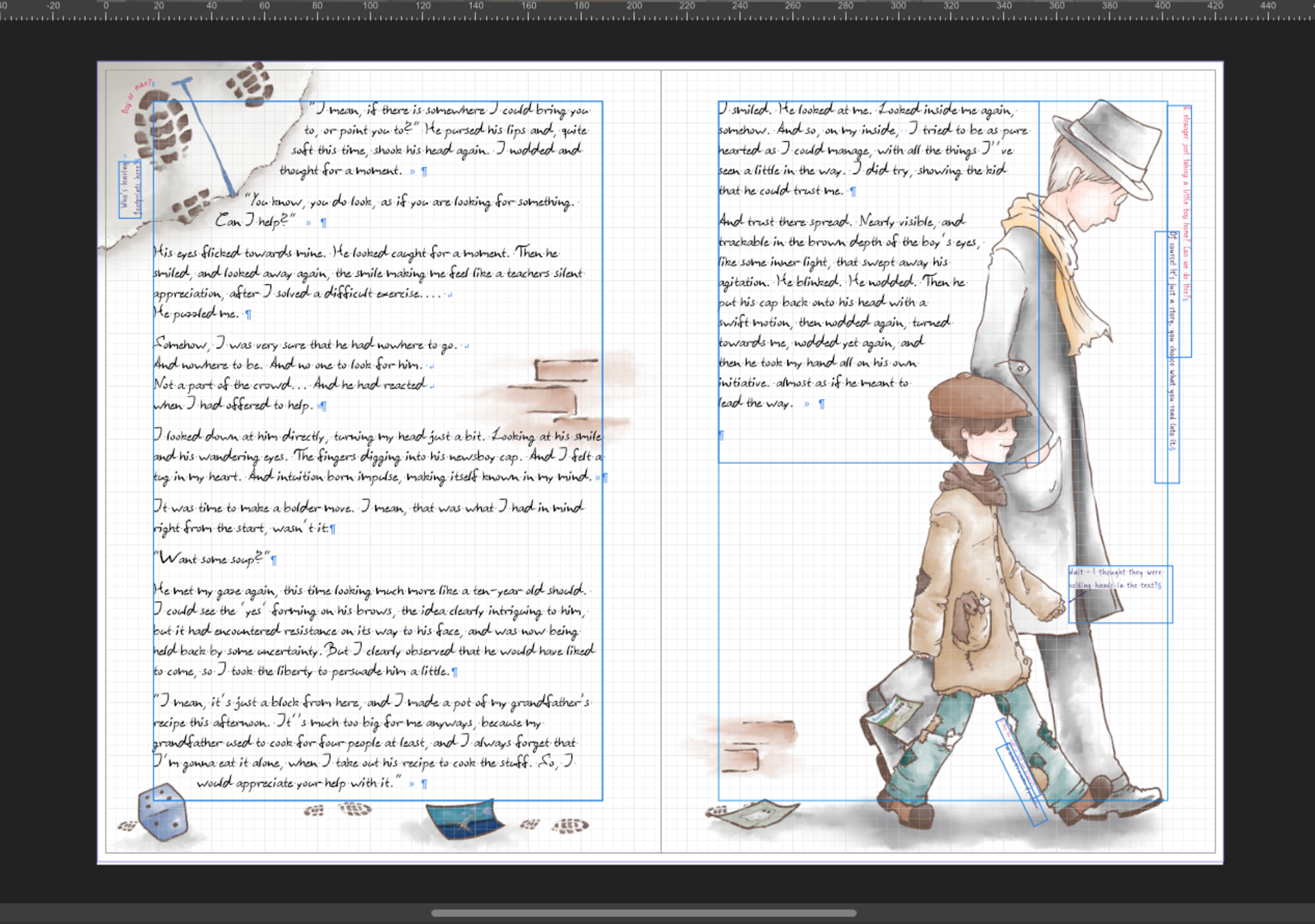
The main grid is the same on all pages of the text, but the elements, especially the boy's treasures or positioning of commentary and random elements (like the walls) change in place or style, which adds to the dreamlike atmosphere the narrator perceives his story in.
Typeface
The typeface in this case is the writer's handwriting. I asked him to write me a long text in which each letter and its capital, as well as punctuation and numbers, occurred at least 3 times. I then organized the text and redrew cleanly the most characteristic yet legible and clear instance of each letter and used Font Creator Pro to create a clean typeface from them. Handwriting is always a little difficult. The legibility is bound to be worse and slower than a good serif font, so a lot of refinement is required. With 330 individually created kerning pairs so far I am happy with the result at this point in our process.
This is an ongoing project and we finish double pages gradually with a wide deadline to allow for other projects and clients to come first. It is a passion project that will be finished over time in cooperation with the writer, and shared again upon completion. It's very enjoyable to work on and I am looking forward to more book and illustration projects to come!