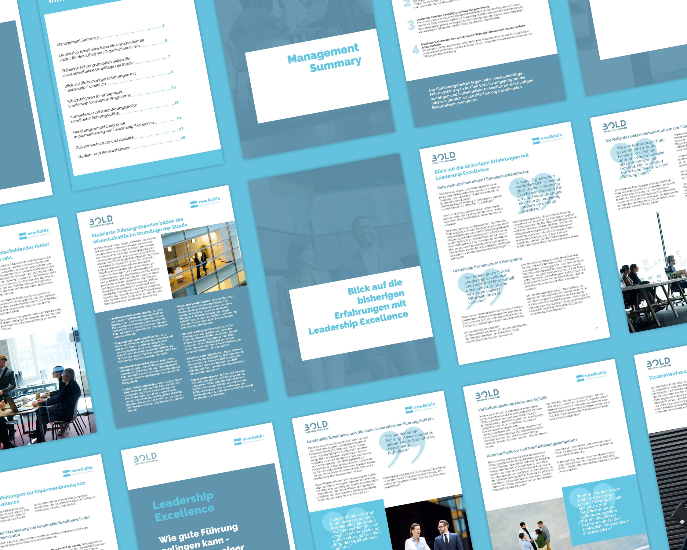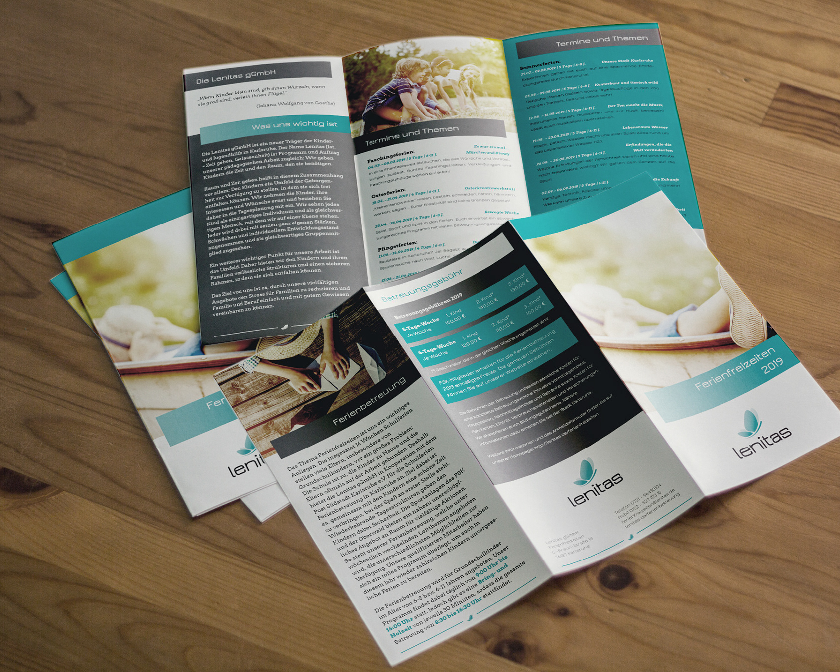
DE:
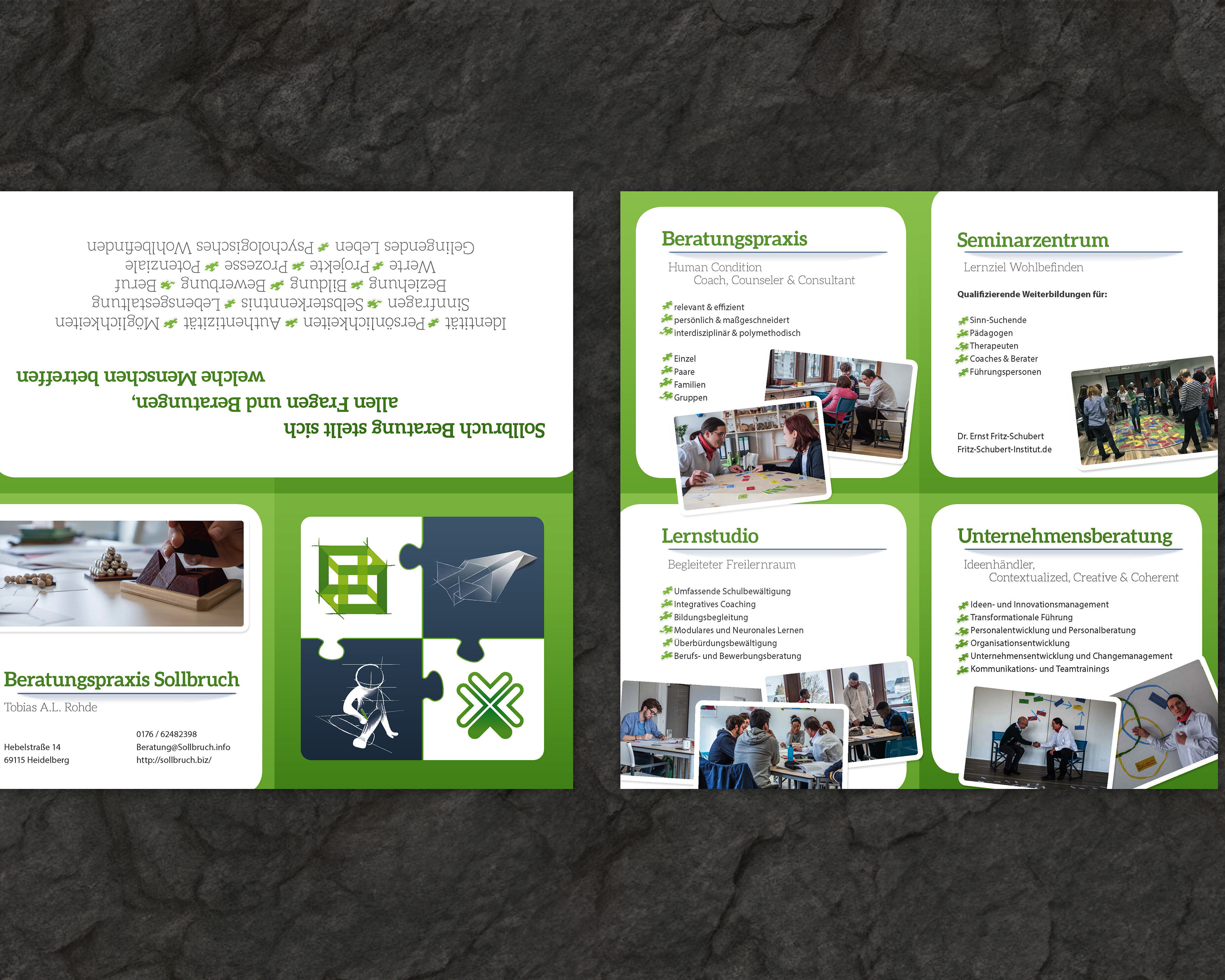
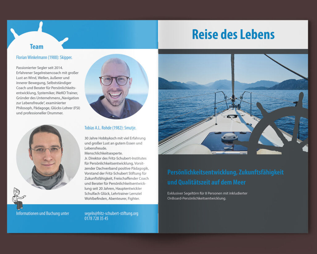
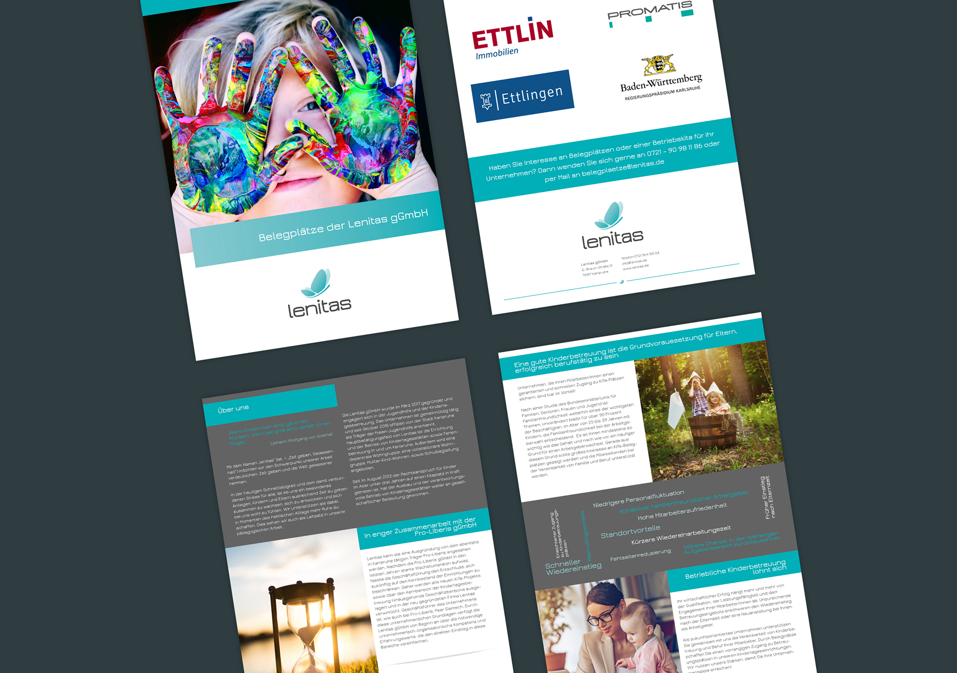
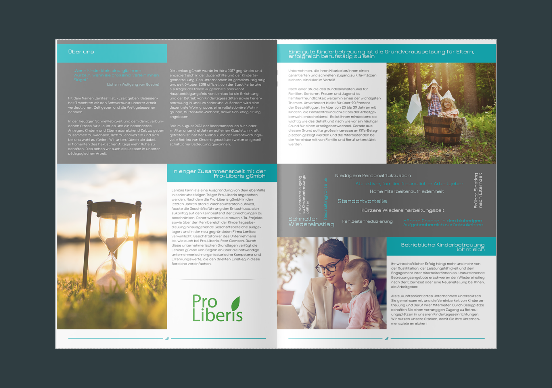
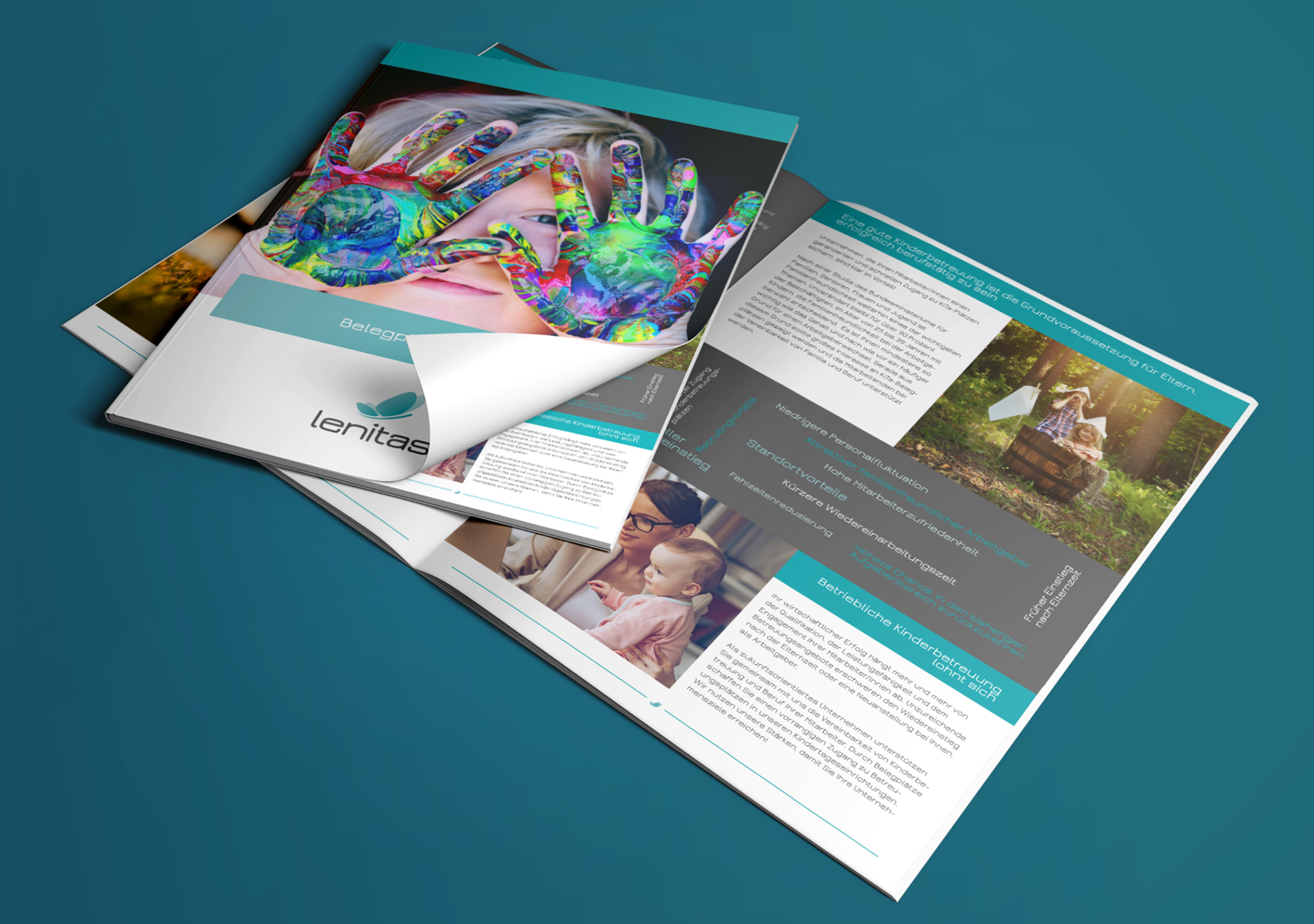
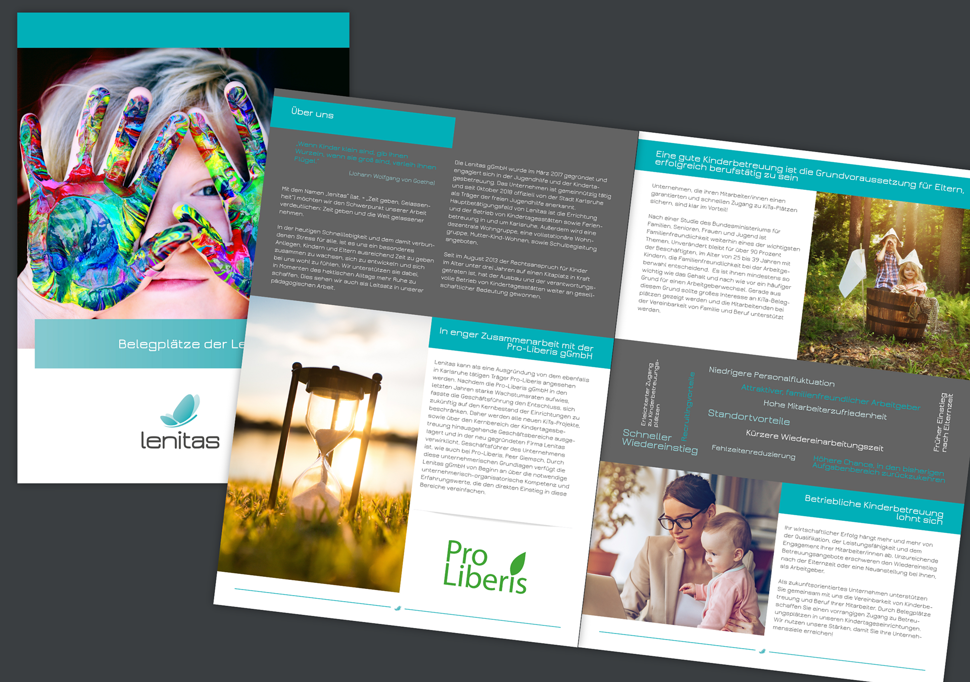
Für die Lenitas gGmbH, einen gemeinnützigen Träger im Bereich Kinder- und Jugendhilfe in Karlsruhe, hatte ich bereits die CI entworfen und habe für dieses Projekt eine 4-seitige Broschüre gestaltet, die das Konzept der Belegplätze für betriebliche Kinderbetreuung klar, visuell ansprechend und der bestehenden CI konform vermittelt. Zielgruppe waren Unternehmen und Institutionen, die sich als familienfreundlicher Arbeitgeber positionieren möchten.
Herausforderung: Employer Branding mit Broschüren zur betrieblichen Kinderbetreuung
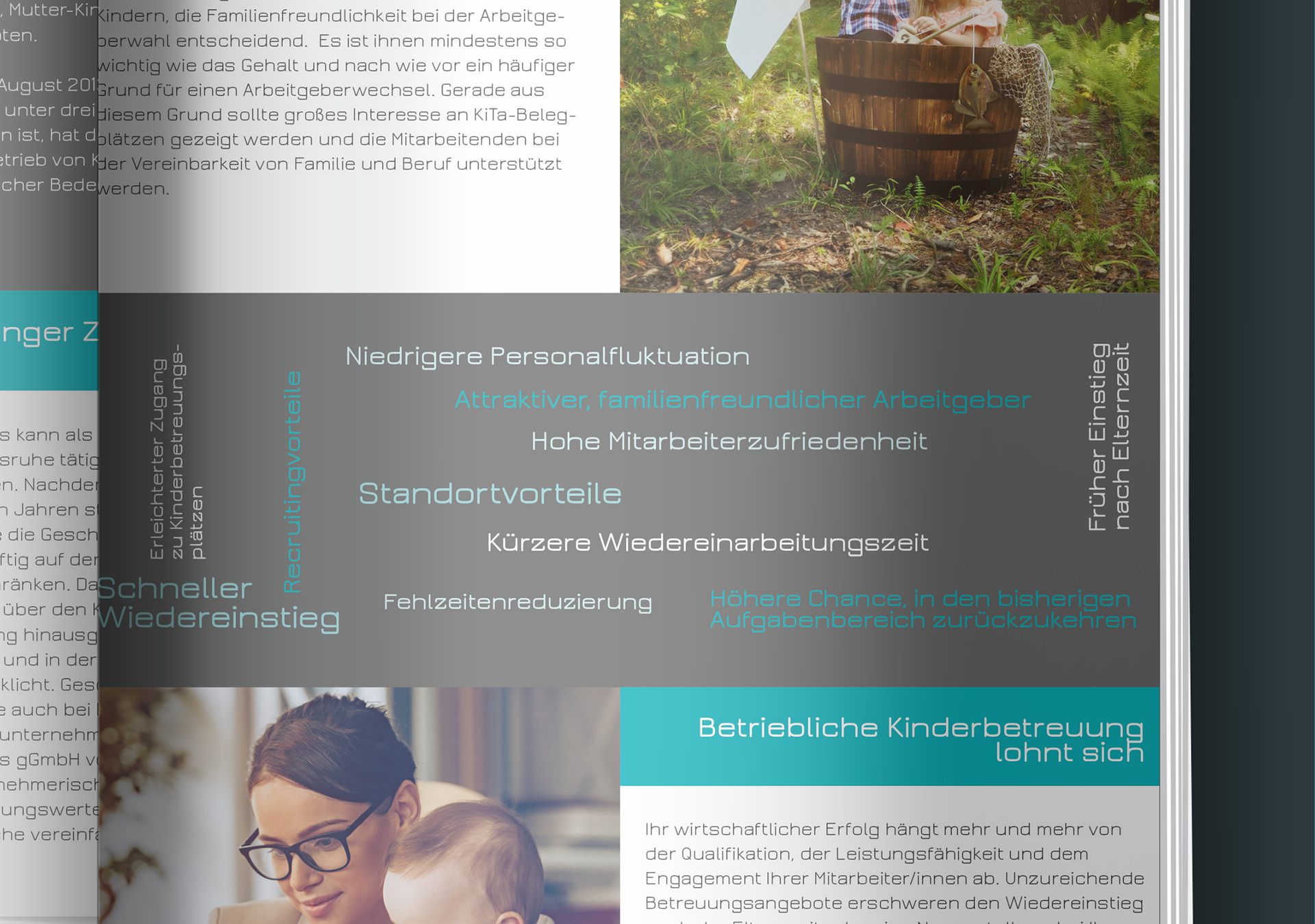
Lenitas benötigte ein Kommunikationsmedium, das Arbeitgeber über die Vorteile von Belegplätzen informiert: Vereinbarkeit von Familie & Beruf, Mitarbeiterzufriedenheit, Standortvorteile und geringere Fluktuation. Die Herausforderung: komplexe Inhalte knapp, visuell attraktiv und zugleich seriös aufzubereiten.
Lösung: Klar strukturiertes Broschüren-Design für Unternehmen & NGOs
Ich entwickelte ein übersichtliches Layout mit klarer Informationshierarchie:
• starke Einstiegsbilder mit emotionaler Ansprache,
• CI-gerechte Blautöne und modern gesetzte Typografie,
• Infografiken und Schlagwort-Clouds, die Kernargumente schnell erfassbar machen,
• Mischung aus inspirierenden Zitaten und sachlicher Information, um Emotion & Professionalität auszubalancieren.
• CI-gerechte Blautöne und modern gesetzte Typografie,
• Infografiken und Schlagwort-Clouds, die Kernargumente schnell erfassbar machen,
• Mischung aus inspirierenden Zitaten und sachlicher Information, um Emotion & Professionalität auszubalancieren.
Ergebnis: Verständliche Broschüre stärkt Arbeitgeberattraktivität & Vertrauen
Die Broschüre vermittelt die Vorteile der betrieblichen Kinderbetreuung auf den Punkt und unterstützt Lenitas in der Kommunikation mit Unternehmen. Arbeitgeber erhalten ein seriöses, familienfreundliches Informationsmaterial, das Vertrauen schafft und die Arbeitgeberattraktivität sichtbar erhöht.
EN:
Building on the corporate identity system I previously developed for Lenitas gGmbH—a Karlsruhe-based non-profit in youth and family services—I designed a 4-page employer branding brochure that leverages that established visual foundation. The piece translates corporate childcare sponsorship concepts into clear, visually compelling narratives targeting HR decision-makers positioning their institutions as family-friendly employers.
Challenge: Employer Branding Through Corporate Childcare Communication
Lenitas needed a B2B communication tool that convinces employers of the business case for childcare sponsorship: work-life balance integration, talent retention, location advantages, and reduced turnover. The task was to present complex social infrastructure benefits in a format that is concise, visually engaging, and professionally credible for C-suite and HR audiences.
Solution: Structured Brochure Design for Corporates & NGOs
Developed a navigable layout utilizing the existing CI framework:
• Visual Storytelling: Hero imagery and custom illustration elements creating emotional entry points into family-friendly employer branding;
• CI-Driven Design System: Existing blue palette and typographic architecture adapted for high-impact brochure format;
• Information Design: Infographics and keyword clouds distilling ROI arguments into scannable visual data;
• Dual-Tone Strategy: Authentic quotes balanced with operational facts, bridging emotional resonance and business-case professionalism.
Result: Accessible brochure strengthens employer attractiveness & trust
The brochure communicates childcare advantages with precision, supporting Lenitas in B2B acquisition conversations. Employers receive credible, family-forward collateral that builds immediate trust while visibly enhancing their employer value proposition in competitive talent markets.
Work With Me
Need investor materials that actually convert?
I specialize in transforming complex B2B and technical content into visual narratives for business contexts.
I specialize in transforming complex B2B and technical content into visual narratives for business contexts.
Let's discuss your next whitepaper or investor deck!
Available for: Information design | Corporate brochures | B2B presentation systems
Available for: Information design | Corporate brochures | B2B presentation systems