
A good design and coherent corporate identity gives your company a professional outfit, helps you be seen, understood and helps to communicate, support trust and business as well as client relations.
On their website, Lenitas.de the privider/carrier for kindergartens, schools, and other educational children / Teenager Services describes their philosophy as follows:
"With the name “Lenitas” (lat. = “giving time, serenity”) we aim to clarify the focus of our work: Giving time and taking the world more calmly. In today’s fast-paced world, and the stress it causes for everyone, we are particularly concerned to give children and parents enough time to grow together, to develop and to feel comfortable with us. We support them in creating more peace in moments of hectic everyday life. We also see this as a guiding principle in our pedagogical work."
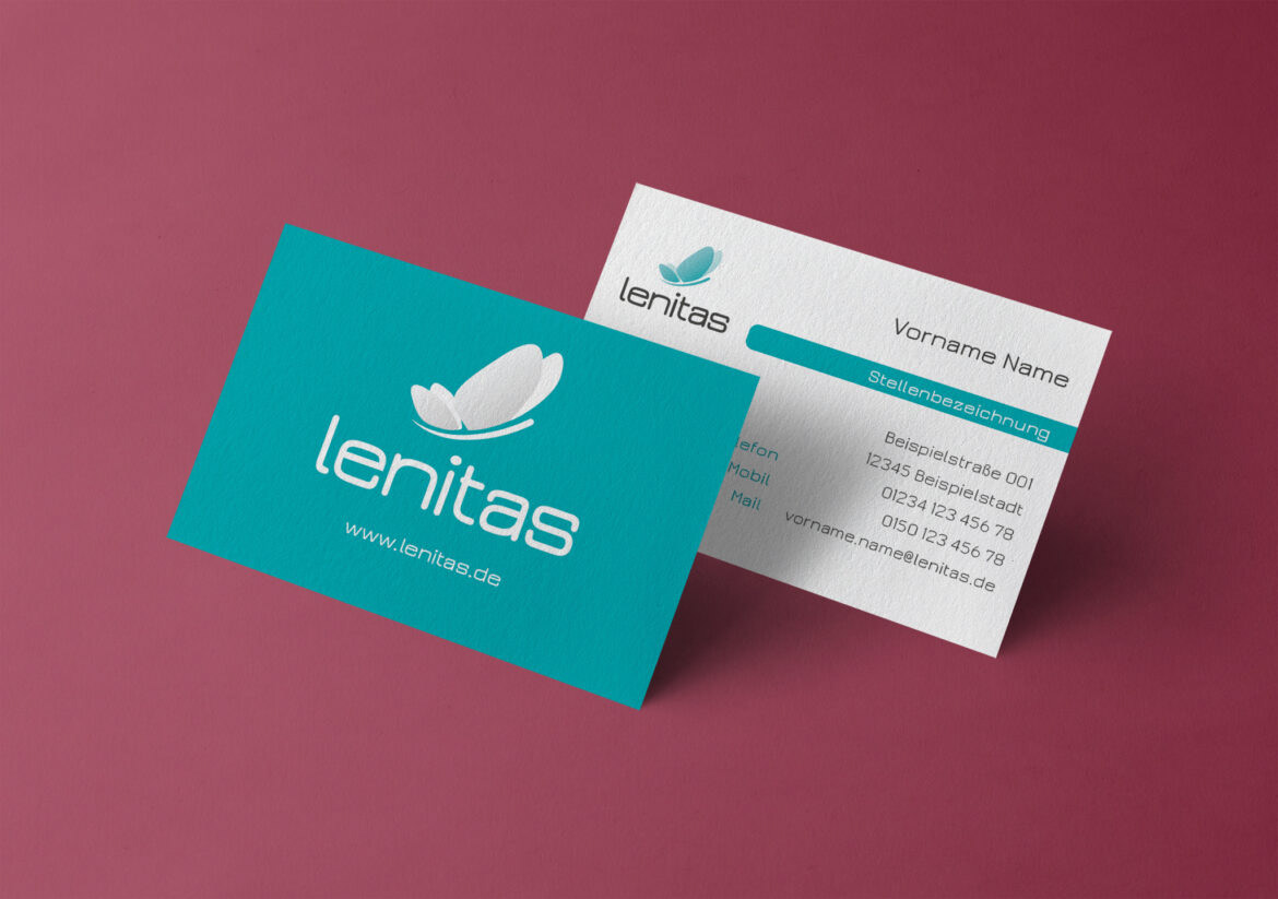
With the smoothness its wide typeface with rounded angles and lines implies and the soft, water resembling turquoise the logo aims to instill serenity and softness with both development and playfulness. The butterfly symbolizes growth, in a playful, positive manner.
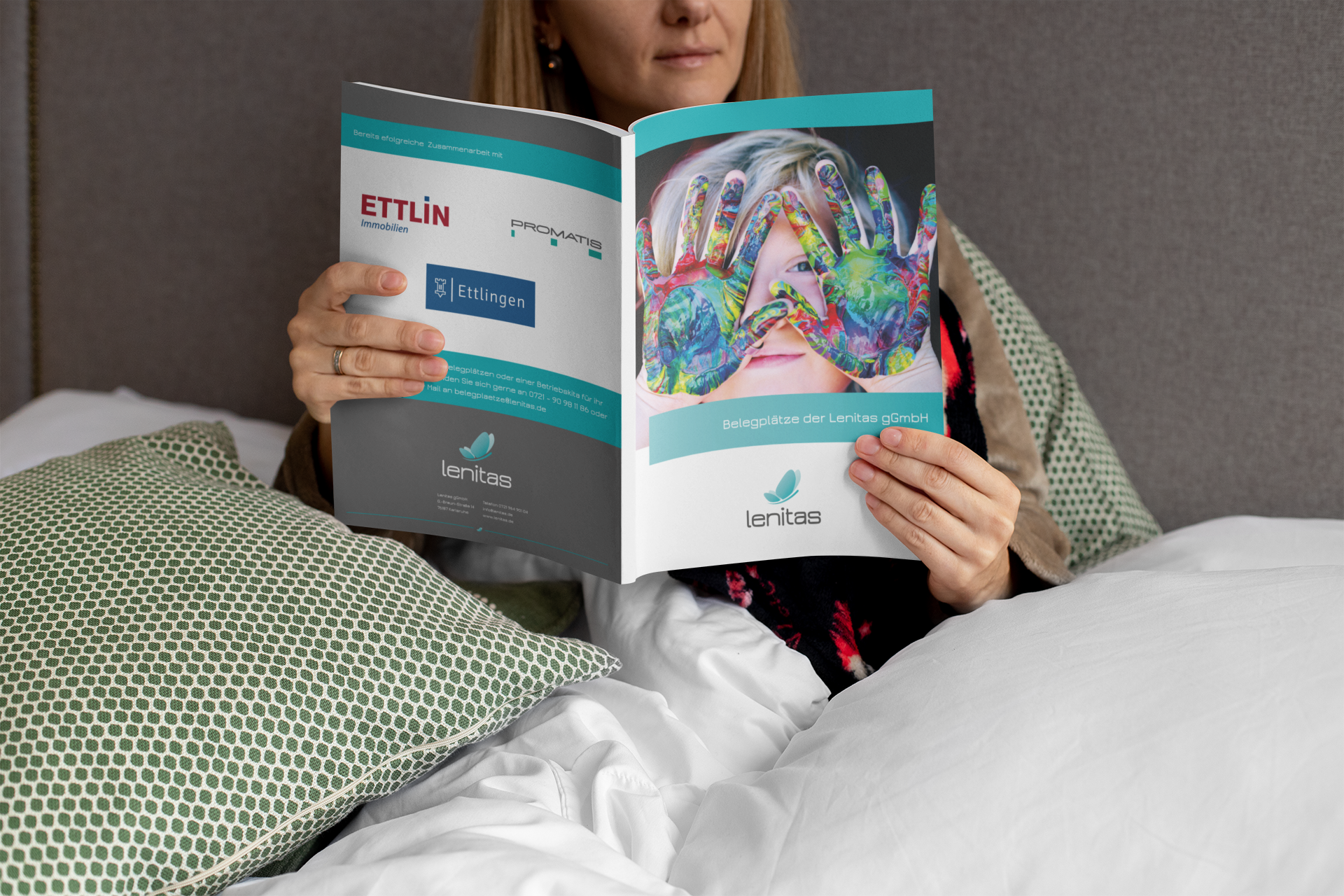
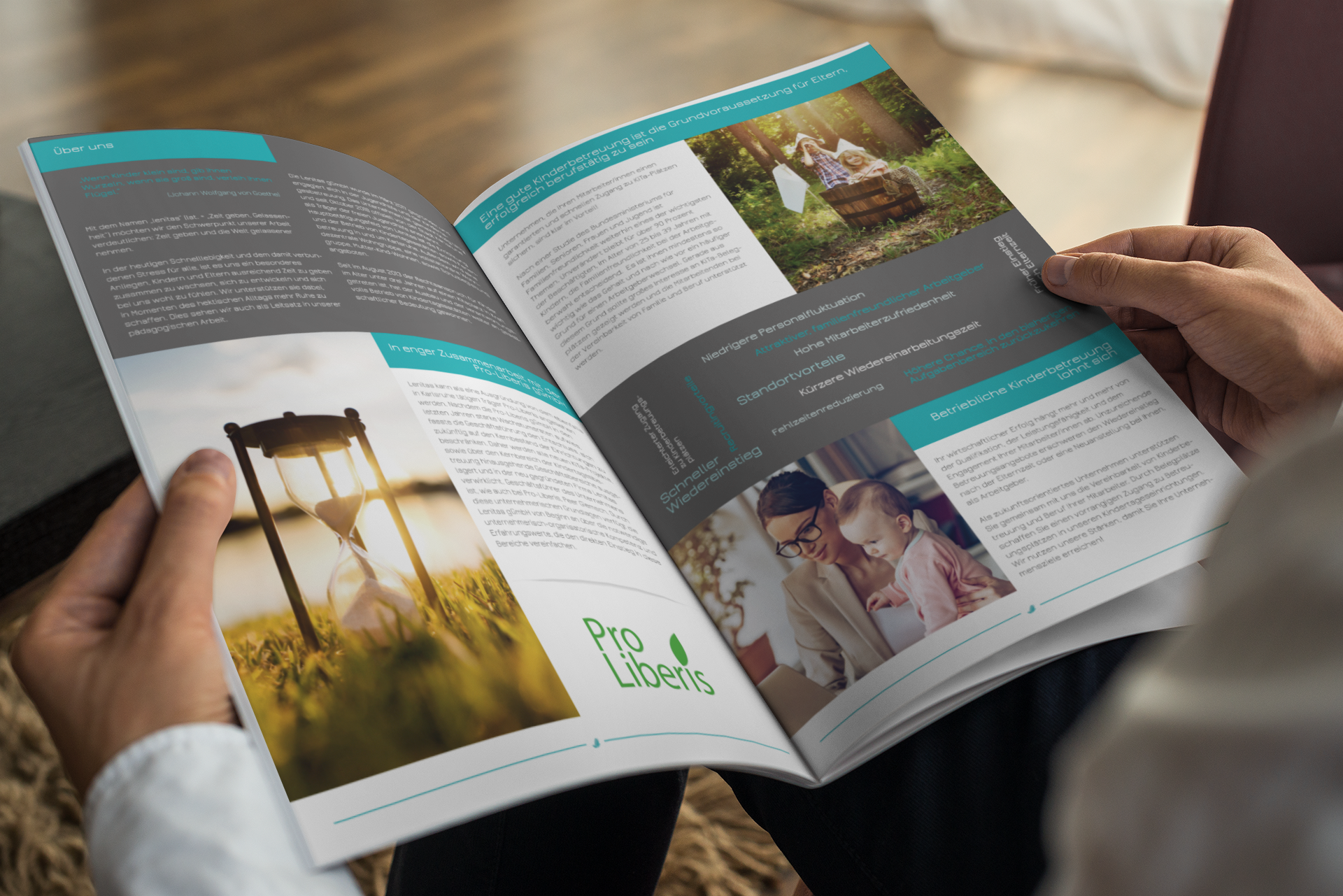
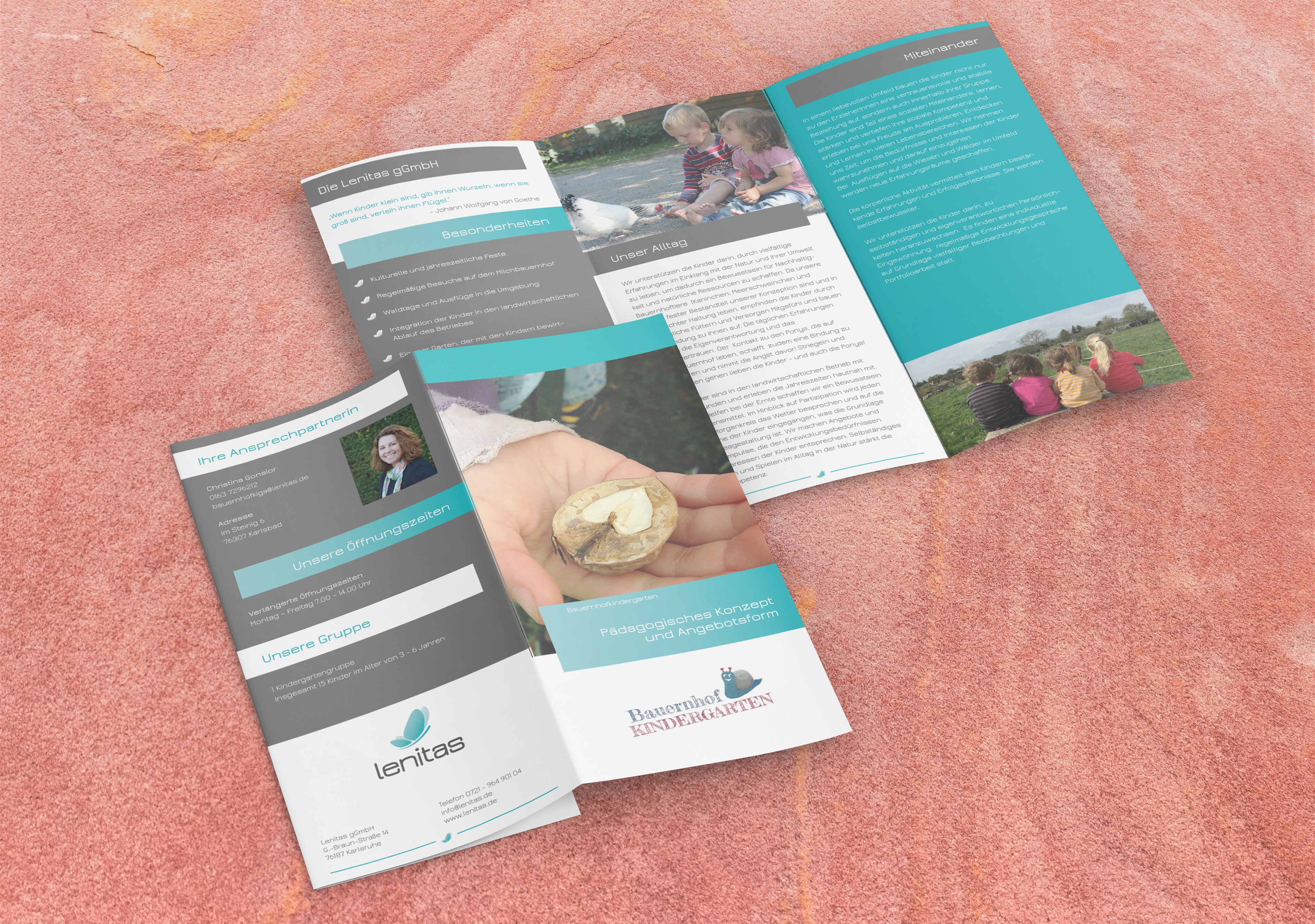
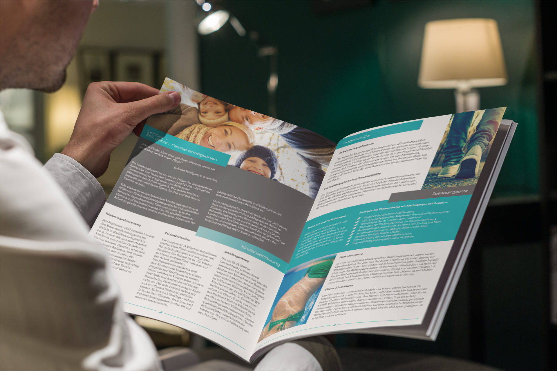
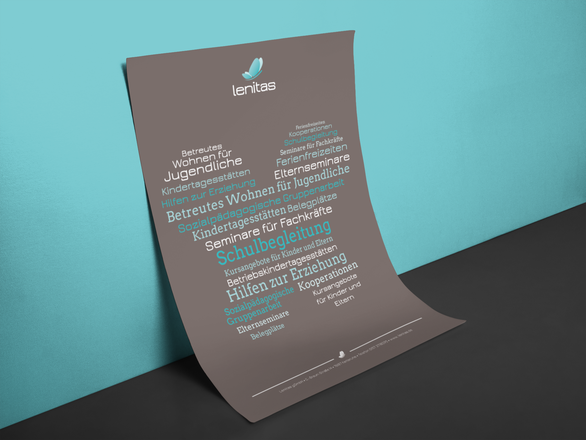
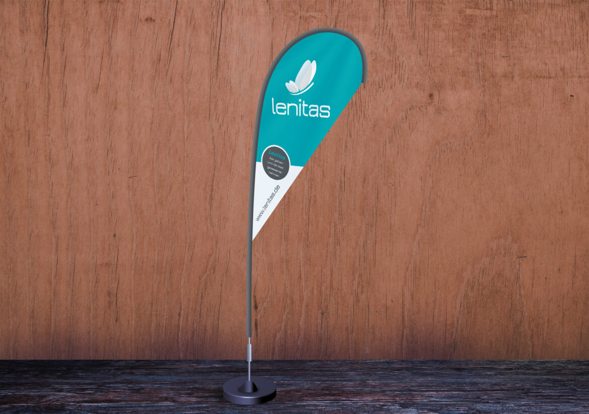
For lenitas, I had the pleasure to not only develop an identity with fonts, colors and visual language. With both brochures and flyers lenitas keeps clients, parents, sponsors and partners informed, up to date and reaffirms trust and connection with the visual language displaying throughout all paperwork, business cards, promotional material or special prints such as posters, flags and banners.